Posts mit dem Label printmaking werden angezeigt. Alle Posts anzeigen

Sonntag, 29. September 2019

"Foliage" - Art Elements Theme Challenge


This month Caroline chose such a wonderful theme - "Foliage". I was surprised that I actually managed to get quite a lot done because we also were on holidays this month... and at work I had a lot to do to get the huge pile done that accumulated during my vacation. *sighs*

Some of the images you may also have seen (the cat prints) since I wrote about how I create my printing plates at Art Elements ("Printing plates and art prints").

So here are my creations. There no coherent plan but rather I simply tried to get the theme incorporated in all my work and sketches. This mixed media piece started out as some card board I used to clean my brayer on top. I love the gold accents. It is a acrylic gold paint from the PrimAcryl series from Horadam and I was surprised how nice it is.


I also brought a new sketch book and my art supplies with me during travelling including my new ceramic test palettes and also the empty make up tins that I tested for their usability as water color palette. ;)

I played less than I expected but that was due to the fact that I didn't like the paper quality. It was an expensive water color sketch book, sadly not 100% cotton because they had none but a high quality one. And nope, not usable for water color. Still, it worked quite well with gouache. 


I love vintage tins!


My muted / earthy / dark palette... there are three additional wells in the lowest row with gouache and Formentera red earth water color (not on the swatch card).


My rather bright / greeny pallette also with additional gouache in the lowest row (and also not on the swatch card). I nearly used ALL yellow gouache due to the paper problem and thankfully I had a lot of white gouache in both palettes. I used it in combination with water color to get more gouache paint because that worked quite well.


The lizards took me several days to finish simply because of all the leaves... and I had to wait in between for everything to dry. The risk running with my hand over some wet paint was... well... it happened ;)


But I so love them! They feel like summer and sunshine. I am thinking about getting some paintings done in this style as well as to scan these to and print them on thin cotton fabric.


And next to each other...


Also some simple nice studies of leaves as well as color studies.


These are the foliage inspired cat prints I wrote about over at Art Elements. My collection was short of a cat printing plate (shocking, I know!) and I combined the theme cat with the challenge theme.


The prints are done on paper as well as MDF board. The coloured backgrounds are made with gouache and the prints with water-based linoprinting ink (both from Schmincke).


The right print is without any foliage... but dots... I mean.... DOTS! Somehow they make everything better (like the lizards!).


This cat print over the yellowish/mustard background is my favorite print of all cat prints. I think I will keep this one for myself an frame it. 


I played a little bit more with gouache + MDF board + simplified foliage and am surprised how well I like this style. Sadly my camera was not able to capture the true turquoise and purple undertones so you will have to take my word that there is much more contrast in the paintings in real life (also I corrected the paint problems on the left leaf).


Since we were on holidays, I also missed a lot of the annual gel printing challenge in September from Birgit Koopsen.... but I managed to get some done. This one fits her monochrome prompt and our foliage theme! 


Thank you for joining us this month! My entries were a little bit over the place but I have to say, I really enjoyed all my experiments with paint and different styles and love the outcome! 

Please have a look at all the participants this month! :)

AE Team
Lesley  
Susan 
Marsha  
Claire  (you are here)
Cathy 
Jenny  
Niky  
Caroline


Guests
Dawn  
Hope  
Alison  
Beth & Evie  
Laurie  
Kathy  
Linda 
Sarajo  
Michelle 
Tammy  
Divya  
Karen  
Alysen  
Mary  
Cat  
Jill 
Sarah
Anita


Dienstag, 30. Juli 2019

"Flowers" - Art Elements Theme Challenge


The theme for our monthly challenge at Art Elements was chosen by Marsha - Flowers! A wonderful summer theme and one that allows for a broad range of interpretation. I really enjoyed it, only work and other obligations cut down heavily on the time (and energy) I had available.


So I won't ramble along like I usually do... but rather show you pictures ;) I played with the moleskin notebooks I got from my Art Elements secret santa. Pen and water color mainly.


I played again with layered monoprints but had to stop since our printer run out of black. Also although I liked the new color combinations I tried out, a lot of them had not enough contrast so I added marks with colored pencils, gel pens, and acrylic pens.


In between I started carving. I had a rubber printing block from a company I am not using anymore since it crumbles way too easy. But I wanted to use up all my leftovers.


With hare...


I also finished a big background printing plate / stamp with an abstract flower design.


For such big prints I use lino paint from Schmincke and thin rice paper. You can see the print through the back while printing.


I forgot to carve three lines... but I somehow like it and may leave it s it is.


The leftover pieces from the border can be used as tiny stamps.


I also made a test print with my hare again. For this I put a mask on the stamp before the printing and added the hare stamp later.


The background needs to be in a different color to enhance the contrast to the hare but I do love the end result!


When you had a look at yesterday's blog post at Art Elements (it was my turn) then you have seen this stamp during the carving process. Here it is finished with the first test print using an archival ink stamping pad...


....and here with lino printing ink. 


I had to add the hare again since this was my original idea - combine the hare with flowers!


....and with color added! Love it!


And at the end: Some of the flowers on our balcony :)


Thank you for coming along to this blog hop and please have a look at what all the participants made! :)

Here is a list of our Visiting Artists:
Alysen
Cat
Divya
Evie and Beth
Jill
Hope
Kathy
Linda
Louise
Martha
Melissa
Michelle
Rozantia
Sarah
Sarajo
Tammy

And our Art Elements Blog Contributors:
Caroline
Cathy
Claire
Jenny
LaneyLesleyMarsha
Susan

Sonntag, 30. Juni 2019

"Selkies" - Art Elements Theme Challenge


This month's theme challenge at Art Elements was chosen by Jenny - Selkies. The inspirations she provided at her Pinterest board were lovely and I though whether I should use the atmosphere, colors and textures as basis for my work... but actually I stuck to a rather literal approach.


I played with water colors and as much as I love this medium, it seems I need a break. Or maybe only holidays ;) But I am using my water color too heavy handed. I like the seal, I don't like the woman.... overworked. I show you all the pieces since there are a lot that go wrong. And that is okay, I still learn from every piece.


I also played with monprints and layered image transfers. If you follow me on Instagram, you may have seen my latest layered prints with my brother's dog as motiv. I also wanted to create some prints for the theme challenge. 


This seal face is my absolute favorite one. I don't know why my camera was playing crazy with the colors. It is a little bit warmer, more turquoise... but I could not adjust the color even later on my computer. Still, love it! 

And there are some layered prints that I leave as they are. This is not one of them! I work on my prints after the print process with pens and paints. Here I used a white polychromos pen to lighten the area around his head on the left side, I used a Copic brush pen to enhance some dark areas at the eyes and around hhead, added the dark whiskers, and last but not least I used a uni ball white gel pen to enhance the white highlights in the eyes. They were already there but needed some more contrast.


Somehow none of my prints for the selkies theme worked like I wanted. Truth to be told, that was frustrating! But after a day rest, or maybe two, I could work on the prints until I liked them. In Htis one the seal was not perfect, so I used the Copic brush pen again to add his nose, dots, enhance some shadows... Seeing the image now in the blog post, I think I will go over with the white polychromos pen as well to add some more highlights. I like to use colored pencils for soft effects. 


Here is the third print, it also didn't work. I was too impatient and used too thick layers of paint. It is not that I don't realize what I am doing wrong. But sometimes by different brain parts seem not to want to work together! ^^ I will still use this and work with it to get the silhouettes from the seal and the woman out of the background.


Here is another example of an idea that did not work. Ok, I think it worked in principle, I wanted to carve out only the highlights of the body to create a nice light and shadow effect. But I am also in the process of using up materials I have and I had some master cut carving blocks left. I never tried them out before and I will never ever buy them again! The material crumbles while carving even with freshly sharpened Pfeil tools, it holds the printing paint badly (worse than rubber or linoleum), and even with a lot of pressure it prints badly. Maybe if I would have a printing press, it would turn out better. But I can print with linoleum without printing press quite well! So...nope... never again! Maybe I will try out this idea with a rubber or linoleum printing plate.  


Now to another stamp that worked out well! With my favorite blue rubber carving material! Made in this kind of retro style that I love to work with right now.


Thank you for joining us! I had hoped to create more prints but I thought at least I could show you some of my struggles. Most of the time I am also only showing what worked and that often gives the wrong impression. ;) Thank you Jenny for a wonderful challenge and please, everyone, have a look at all the participants!

Guests: 

AE team: 
Claire (you are here)

Sonntag, 31. März 2019

"Luna moth" - Art Element Theme Challenge


This months theme for the Art Elements theme challenge was chosen by Jennifer - " Luna moth". I have to say this was a difficult theme for me as much as I love these insects (and insects in general are simply stunning creatures!). Maybe it was simply the fact that I got ill, there were a lot of deadlines, I spend some long days writing grant applications, and also went to a conference. Sometimes a too literal theme stuns me in the beginning.


I know, I could have simply taken the colors alone as inspiration or create an abstract pattern but once your brain is stuck... it is not easy to get it working again. The only way that works for me is actually to start creating something even without inspiration or any idea. So I tried to sketch a luna moth to get a better feeling for the shape, pattern, size and overall shape. The upper wings are not wide enough but it helped.


If you follow me here or read my blog post at Art Elements, you know that I don't like most commercial available water color sketch books and started binding my own ones. I still wanted to try out the Moleskin one. Although I am not such a fan of the art sketch book, I have to say the water color book works really good! I was pleasantly surprised. The only downside? It is so damn expensive... 


When I am stuck, I love to create color swatches. They are so relaxing, to see the colors flow has something so beautiful and joyful. It lead to another try to pain a luna moth. It is okay but I am not in love with it. Just a... meh...


But you know what? This kind of challenges where I am stuck in the beginning can be the best! Because it forces me to think. Jennifer shared her carved stamps in the last theme challenges and just showed her tiny sketchbook made with tiny wee carved pattern stamps for the sketchbook project (have a look here). The last time I carved anything is a year ago and I thought maybe I should change the medium.


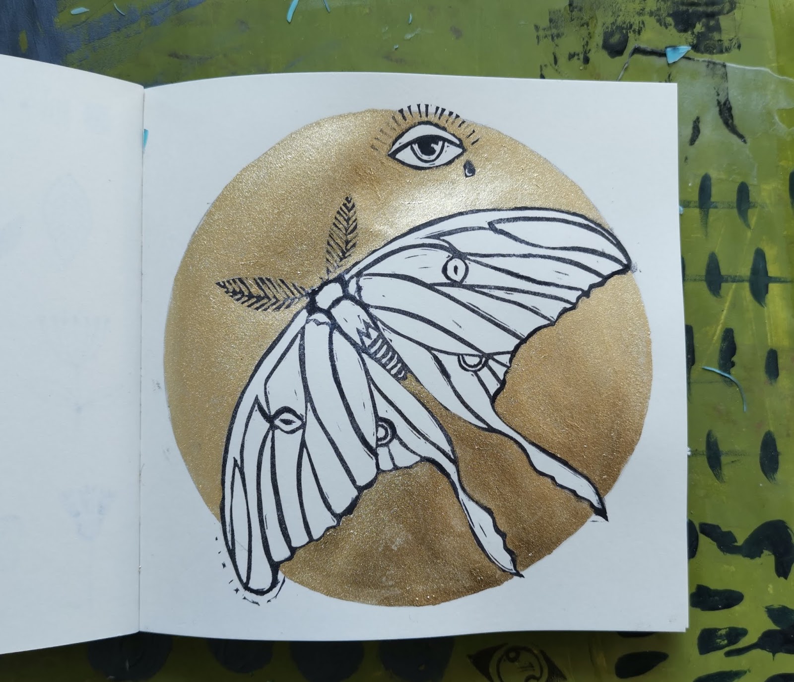
I simplified the shape of the luna moth...


....and I wanted to add eyes. I don't know why but the image of eyes, the moth and the moon kept coming up in my head.


If you want to mirror copy a stamp, simply stamp it with watter resistant ink on the rubber. Now you can carve it. If it should be the same orientation like the original one, simply to it again with the mirror image stamp. Yes, they will be a little bit different but in the end it should still be a handcarved and unique stamp.


I tried out several shapes and pattern for the eyes. In the end my favorite was the one with the tear drop that I copied to have a pair to be combined. The only thing I changed in the mirror stamp: The light reflection should come from the same side!


I played with the stamps and water color. Just playing...


This pink card was a birthday card for a friend. The moth is maybe a little bit too big for cards. 


I also created several test prints on high quality paper.


I think this one is my favorite with a single eye on top. Maybe I will add a moon / circle in the background.


I also need to play more about how I could incorporate the eyes. 


By the way, if you want to add metal effects in your water color, I really can recommend Aqua Bronze from Schmincke. It is made of metal powder and not mica. It comes in a powder form that includes a kind of glue. You have to wet it with water (every time fresh!) and then you can apply it as paint. It takes some experimenting with the ratio and paper since the metal particles can be easier rubbed off than pigments. Depending what you want to do with the finished piece you should fix it.


But it looks so stunning! No other paint ever came close, it has an effect like metal foil! I also have a silver version. 


As always... shimmer and shine is difficult to capture on camera.


In the end I actually had another go at a luna moth painting. This time it worked for me and I like the finished piece. The trick was to go for different colors. There is still green but combined with turquoise and not anymore this neon like light green. It may be not the true color of luna moths but somehow it looks more real to me.


As much as I struggled in the beginning of this theme challenge, I really love where it lead me. My absolute favorite? The eye stamp(s) with the tear drop! I think this may become one of my favorite and most used stamps ever!


Thank you for joining us and please have a look at the ideas and creations of everyone! :)

Guests:

Art Elements Team:
Claire (you are here)


LinkWithin

Related Posts with Thumbnails